Showing posts with label SP500. Show all posts

Wednesday, April 7, 2010

GOOGLE SPREADSHEETS; SPDR's & SP500


On the top this site you will see a "STUFF" tab. This is something I am developing and will continue to update and improve. Let me know your suggestions as I go along.

I have developed two Google spreadsheets for the top 10 SP500 constituents, such as Exxon, Microsoft, etc., and for SPDR's. Let me know what you think. Hopefully we can get some indicators or perspective on the market from these. Be sure to check back frequently because they will continue to improve as I get new ideas and Google provides more functionality.

Wednesday, March 31, 2010

RELATIVE VOLATILITY 10YR NOTE TO SP500


In some earlier posts I discussed dissipative systems and entropy. For purposes of this post I will use the interaction of two open and dissipative systems, the US bond market (10 year notes) and the US stock market (SPY). In addition, I am making some assumptions. The first is that I like to think of entropy in the markets as equivalent to the amount of information and uncertainty that exists. The second is that higher standard deviation is equivalent to higher entropy. A higher standard deviation means prices are more variable and erratic. This is a result of more uncertainty, and consequently, more entropy in the market. In addition, this can also be thought of in reverse--less risk leads to less uncertainty, and consequently, less entropy.

In general, standard deviation is used as a measure of volatility in a market. Markets become more volatile as the level of uncertainty grows. I have created two graphs which show the standard deviation of both markets since the beginning of 2007. One graph shows that if the relative volatility is greater than 1, then stock prices have a higher level of entropy compared to bond prices. If less than 1, then bond prices have more entropy than stock prices. The second graph shows the actual standard deviation of each market. Two quick conclusions can be made from these charts. The first is that volatility has significantly declined in both markets since the height of the financial crises, and second, the volatility in bonds is higher relative to stocks. More next time…

Tuesday, March 30, 2010

Large Traders


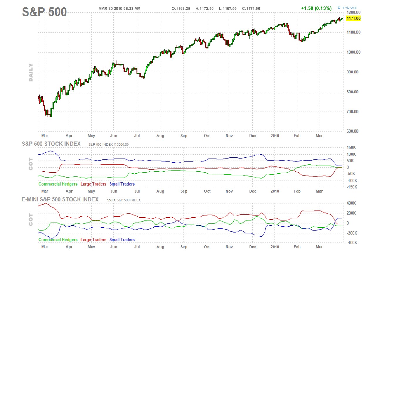
Attached is a daily chart of the SP500 provided by FINVIZ.COM, a site I think does a good job of presenting financial data. What I find interesting in this chart is the bottom two graphs, particularly the red line. The red line is the COT report of positions held by large traders. Since the middle of January 2010 large traders have been taking opposite positions in the large contract vs. the Emini. This is odd, but I have learned over the years that many things in the market do not make sense when we try to rationalize what is happening. The other thing I have learned is that when something seems odd you better pay attention; there might be more going on then you can tell. One last observation is that in both contracts large traders are right near the zero line. My conclusion from all this is that we are probably going to get a breakout in some direction pretty soon. Let's see how this plays out...

Thursday, March 25, 2010

AUTOMATED STOCK TRADING PROGRAM SP500

We have created a computer program which is a variation of one of the trading models that we use to trade the SP500 futures. We run the program each morning on all the individual stocks comprising the SP500. We hope to eventually create a fully automated trading program with it. The study began in October 2008 and is ongoing. We will post our daily and historical results here.

AUTOMATED INSTITUTIONAL STOCK TRADING PROGRAM FOR SP500