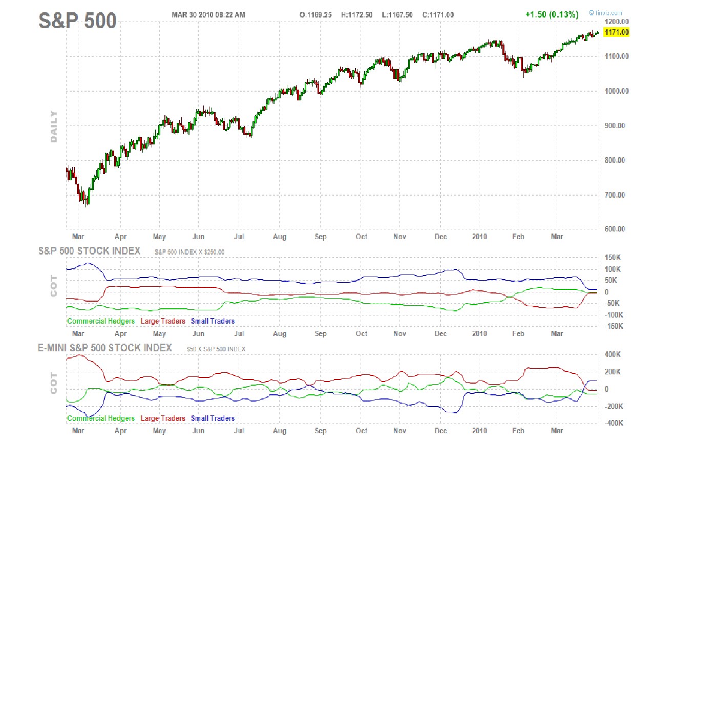
Attached is a daily chart of the SP500 provided by FINVIZ.COM, a site I think does a good job of presenting financial data. What I find interesting in this chart is the bottom two graphs, particularly the red line. The red line is the COT report of positions held by large traders. Since the middle of January 2010 large traders have been taking opposite positions in the large contract vs. the Emini. This is odd, but I have learned over the years that many things in the market do not make sense when we try to rationalize what is happening. The other thing I have learned is that when something seems odd you better pay attention; there might be more going on then you can tell. One last observation is that in both contracts large traders are right near the zero line. My conclusion from all this is that we are probably going to get a breakout in some direction pretty soon. Let's see how this plays out...
No comments:
Post a Comment